


|
|
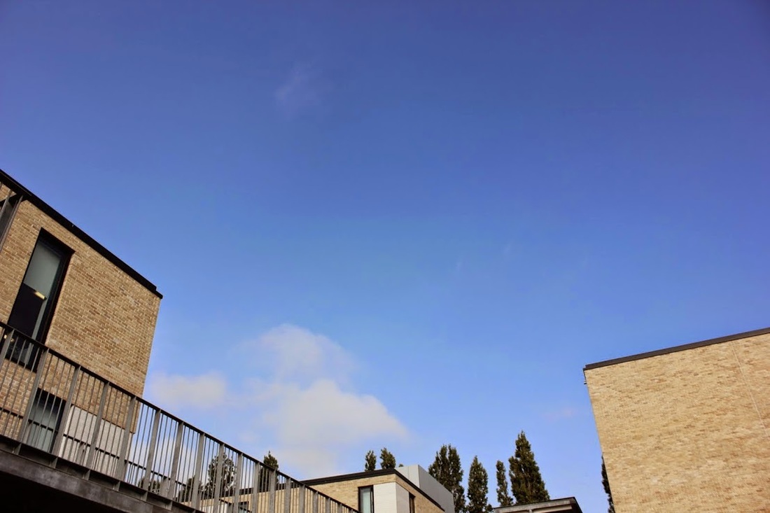
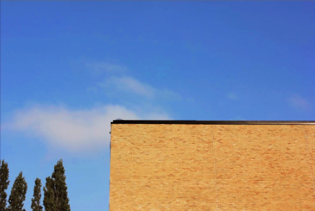
I chose to edit this picture because I really like the way that their is loads of blue sky and how there is a rectangular shape of the school building, as it links to contrast. When editing this picture I wanted to use contrast on the sky and the building to make it more brighter and contrasted, I edited the trees but it went quite blurry.
|
|
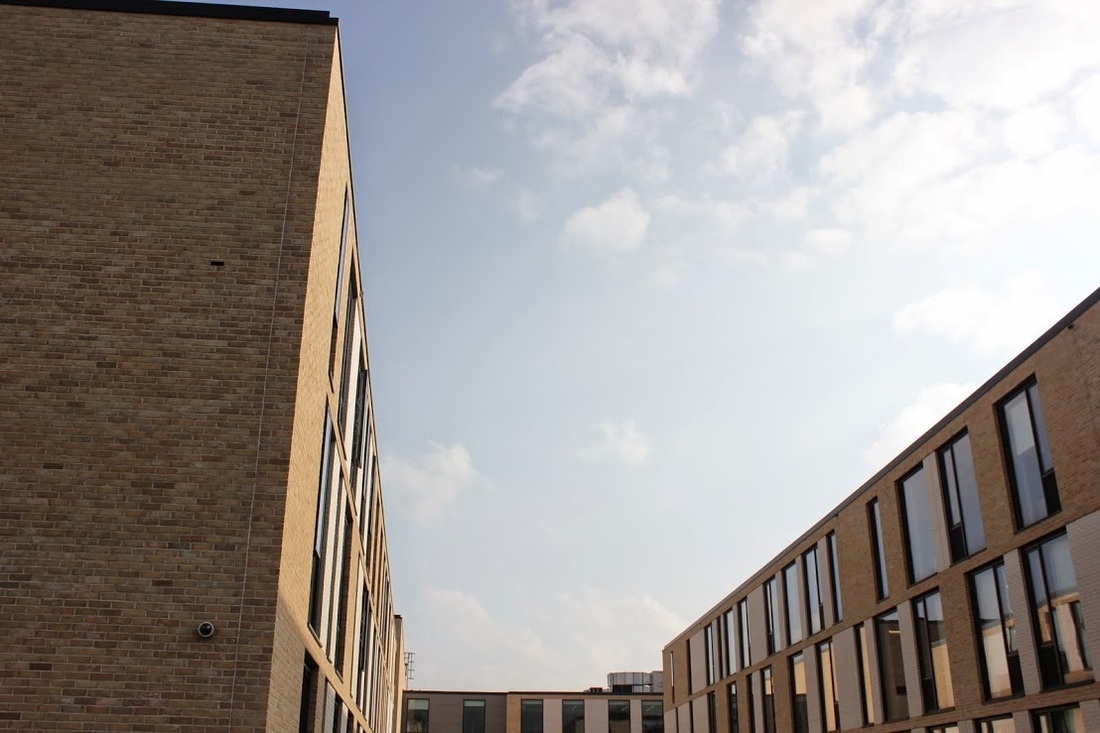
This picture is my least favourite as it's too contrasted and you can tell it's been edited, to improve I would lower the contrast on the sky and the leaves.
|
|
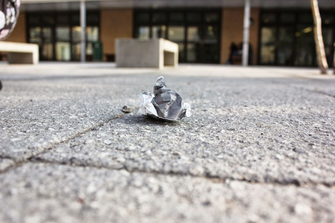
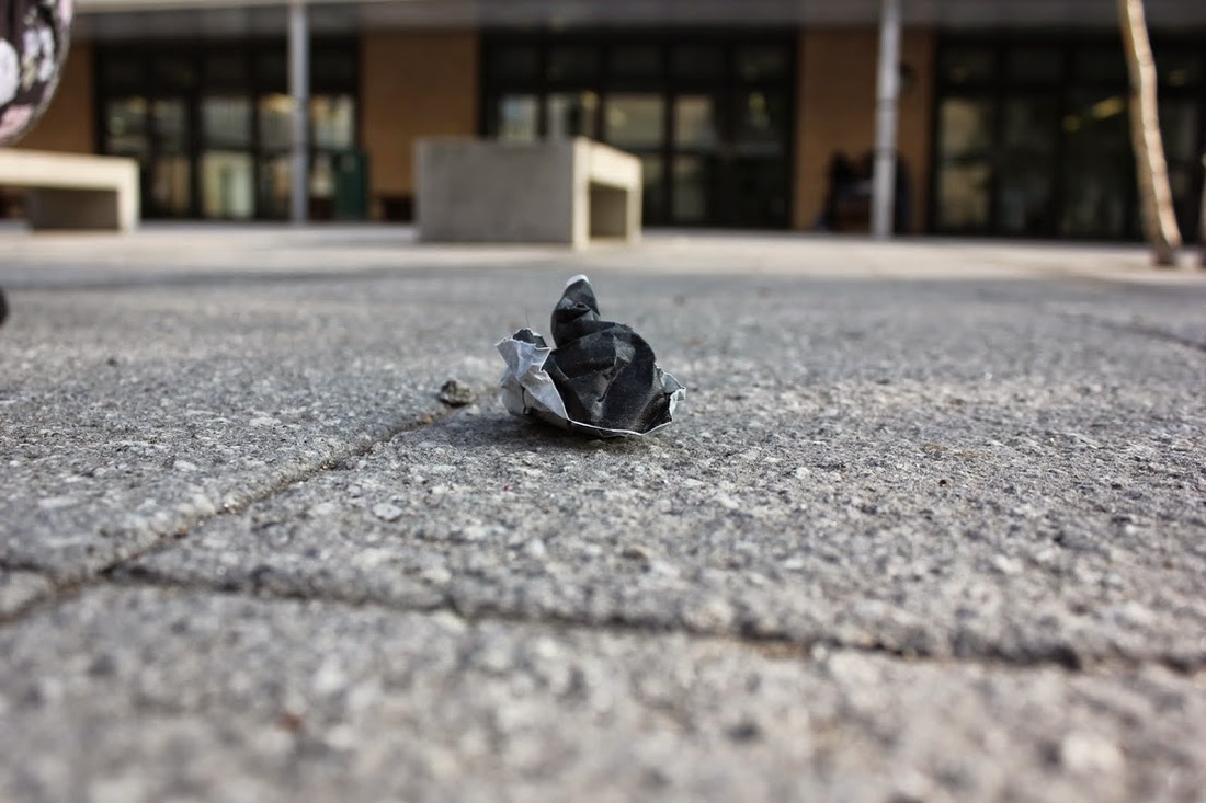
Ive changed a lot of in this picture, i've brighten the contrast of the gravel of the paper in which you can see the detail of the paper.
|
|
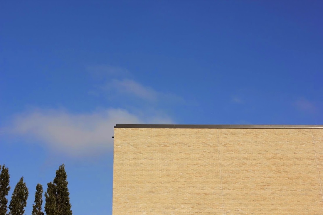
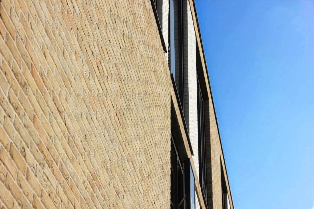
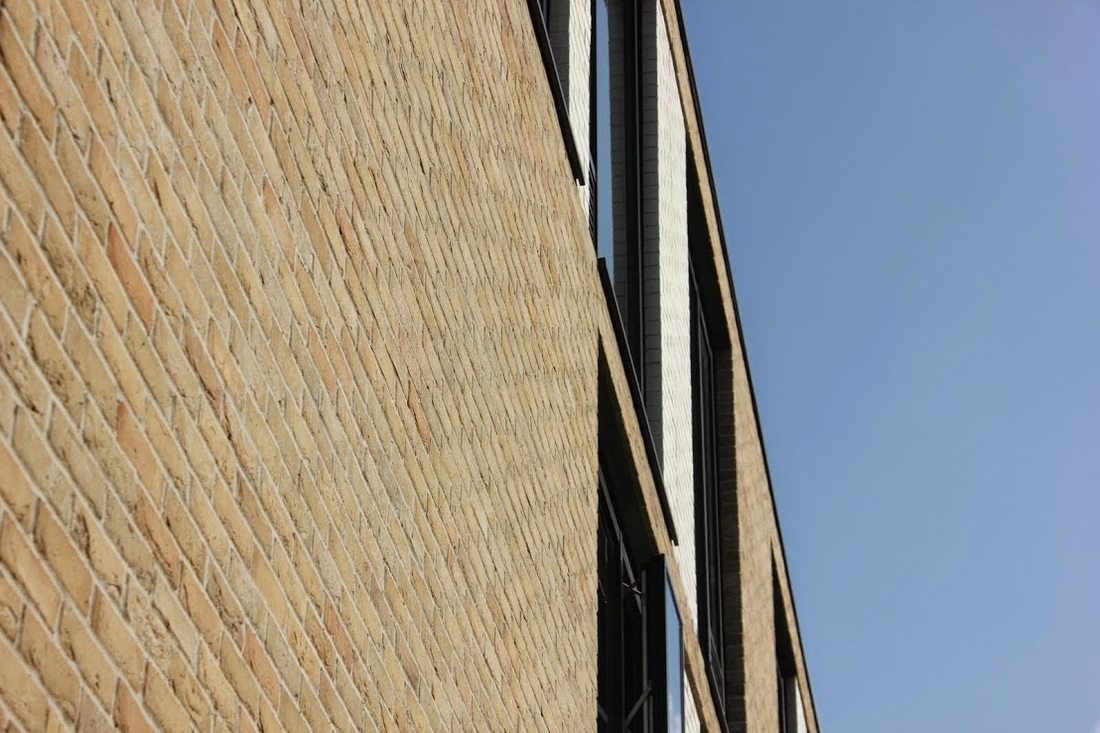
This is one of my favourite pictures that I have photoshopped, In picture 1 you can see that I have brightened the contrast of the sky as I thought in the original one the sky looks quite bland and dull, especially with the bricks as well. Which the edited picture it looks like different times of day and different weather which I really like as it looks improved.
|
|
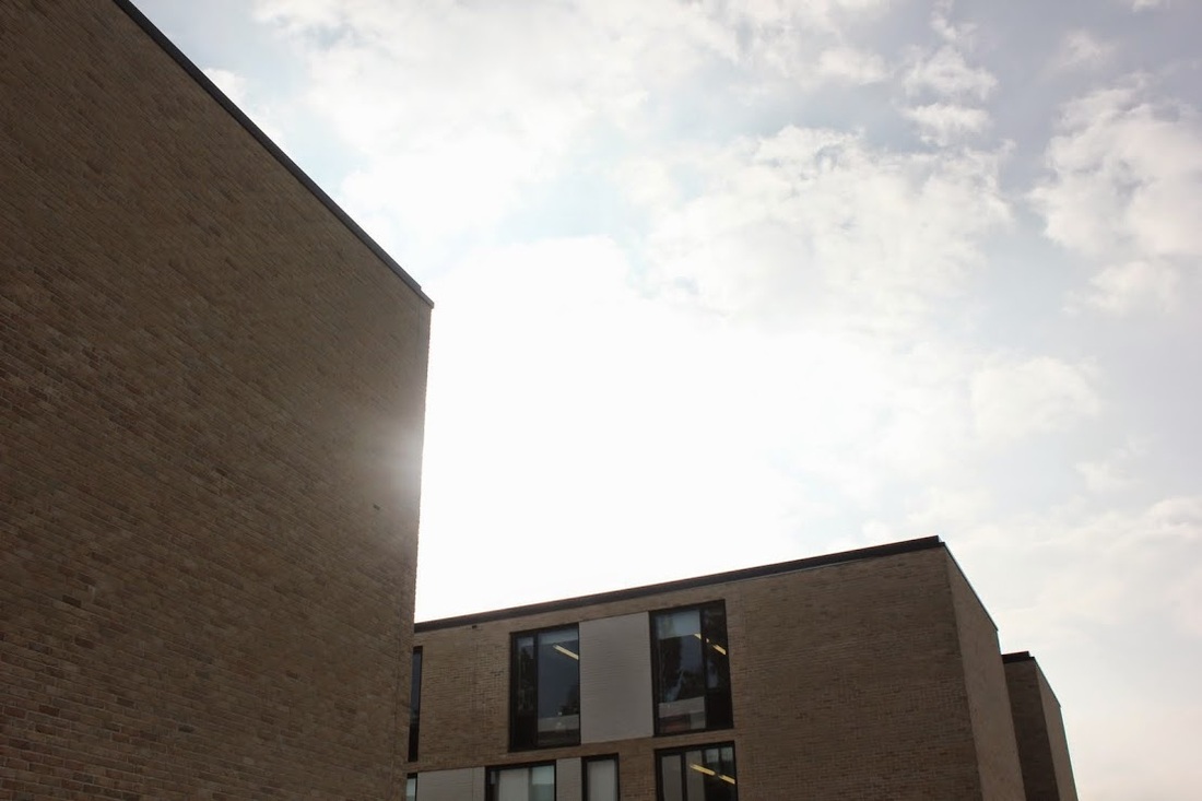
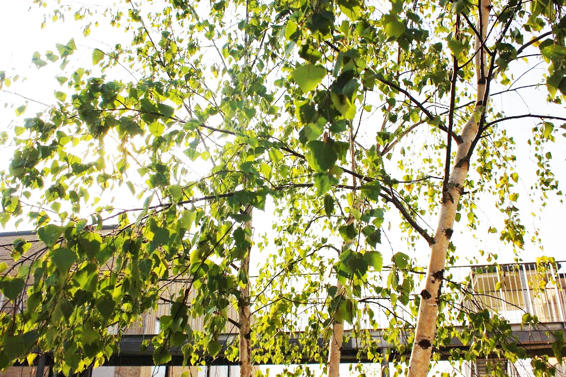
I prefer the edited picture compared to the original, as everything seems more brighter and glowing. The contras leaves on the tree in the photoshop didn't go so well as they are exposed quite a lot, In the right top corner of the picture I like how I have edited the sky it looks like a darker grey. As I had edited it though it did give a stronger contrast to the leaves again.
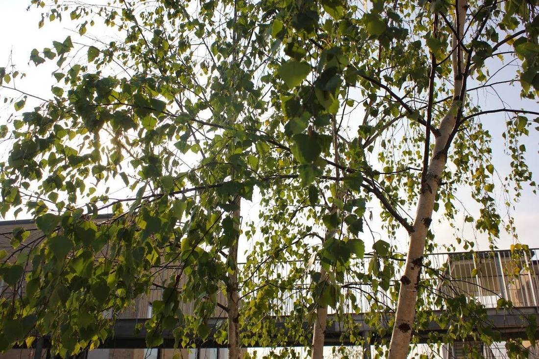
To improve I would lower the contrast and keep it more of a normal filter and maybe just have a slight brightness contrast.
To improve I would lower the contrast and keep it more of a normal filter and maybe just have a slight brightness contrast.
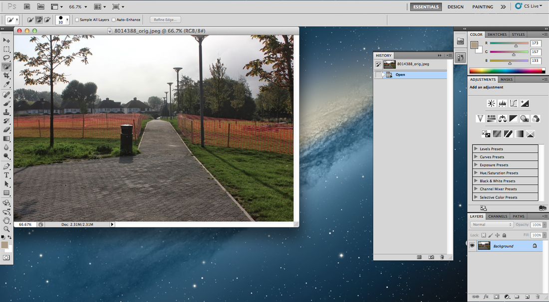
Here is a screenshot: Here I have chosen a picture for photoshop and which I will be editing, I chose this one because I thought it would be a good one to experiment with as theres so much going on in the picture.
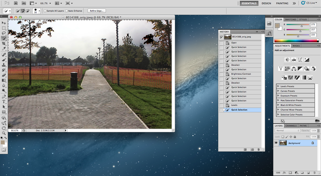
In this picture I have chosen the space which I wanted to work on most and use a brighter contrast.
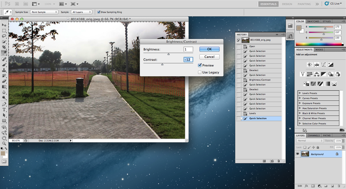
Here you can see this is how you can adjust the brightness and contrast.
|
|
|
|
|
|

This is Katrine De Blouwer's work.
I used a different picture as I couldn't find the one that I had started on in lesson.
This work defines a lot of contrast, such as edges, texture, colour; light and dark. Shadows and also a lot of emotion, etc.
I think this picture is quite imaginative, because their is no real statement to what is going on. With the dull dark colours contrasted with the bright red and the light browny colour gives it the real effect. The picture of the arm and the stairs tells me that maybe someone has fallen, someone maybe could have died which the red contrasts with blood and death. The shadows of the picture is still which reflects on silence. The red part of the picture kind of looks like fire, not sure whether that has anything to do with it but it seems as it is in my opinion.
I really like this picture cause there's a lot to tell about what is going on and there's no truth behind it.
Thomas Ostgulan
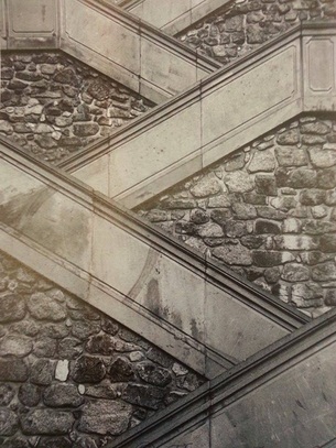
This picture looks like a diagonal staircase, I like the way in which it goes diagonal in the opposite ways. It has a lot of lines on and lots off different shapes with the rocks which is cemented into the wall. This picture has a range of different textures like the smoothness of the stairs and the bumpiness of the rock wall, the colours are based on quite dull emotionless with the black and grey scale.
I really like how the colour of this picture is pretty bland and dull I think it creates more of a better effect to the picture.
The picture doesn't really look 3D it looks quite flat, even though I know it's a stair case I think it should show something like people walking up, creating a moving image to give more of an interesting feel to the image. It's quite crammy in the picture, there's a quite a lot going on in the picture there's no free space.
aaron Siskind
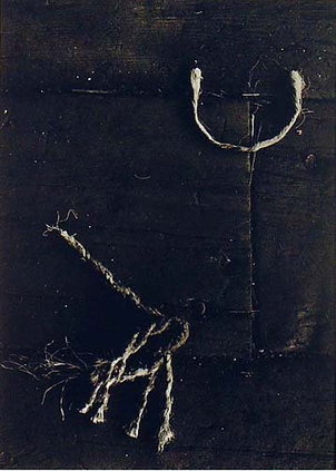
I can't really tell what's going on in this picture. It look's like a picture which has been taken in the dark or has been edited, I can see loose strings and look's like floor boards. This picture seems as if it's been been taken many years ago, it seems like it's been taken on an old fashion camera not a new focused one.
Fabien Baron
''Fabien Baron is a French director, art director and magazine editor. Best known for his iconic ad campaigns and work as editorial director of Andy Warhol's Interview magazine.''
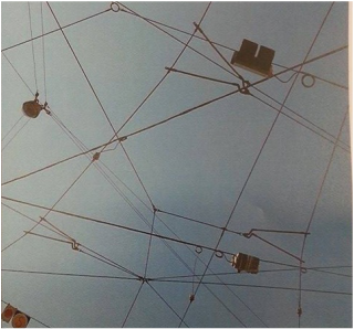
This photograph has been taken by Fabian Baron, his work is based on contrast. It's contrasted with lines from all different angles, with all the different lines going across each other it creates shapes in itself. I can see triangles, rectangles rhombus's etc. The lines in the picture are street cables, which are mostly around in America.
This picture is environmental, it's been taken outside. I would say that this picture is a fairly recent picture as it's taken with a good quality camera in which shows us it must've been taken maybe a couple of years ago or fairly recently.
This picture is been taken faced up to the sky, it looks as if we are trapped between the world and space its self, as there is negative space where we can't get passed. Theres not many colours in the picture but black and blue, blue being positive and black being negative.
